
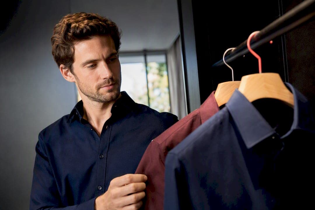
Navy, charcoal, deep green and burgundy are your safest bets for a Tinder photo, alongside mid-tone blues. These colours keep the focus on your face, hold their texture at thumbnail size, and avoid the colour casts that ruin skin tone. Be cautious with true neon shades and think twice about pure white or pure black, especially in harsh sunlight, since both tend to lose detail once the app compresses your image.
TL;DR:
- Mid-tone solid colours like navy, charcoal, deep green, and burgundy are safest for photos because they photograph well across various lighting and backgrounds.
- Pure white and black shirts tend to lose detail during compression and can cast unwanted hues onto your face, making them risky choices in bright sunlight or high-contrast environments.
- Testing shirt colours by changing settings and checking thumbnails helps ensure your face still draws attention and complements your skin tone and background.
- Fit is more crucial than colour; shirts that are too loose or tight harm your appearance, and solid textures outperform patterns that can cause moiré effects on camera sensors.
- Using AI photo analysis can identify which shirt colour and photo setup perform best for your individual face and lighting conditions at a low cost.
Table of Contents
- What colour shirt looks best in a Tinder photo?
- Why does shirt colour matter for camera sensors and thumbnails?
- How to pick a shirt colour for your skin tone and background
- Fit and structure beat colour choice almost every time
- Colour and outfit mistakes that quietly kill matches
- What does the evidence actually say about shirt colour?
- Does shirt colour change how people perceive your personality?
- Do cultural or regional colour preferences matter on dating apps?
- The Team @ DoubleMyMatches: what we've seen work in real profiles
- See exactly which shirt colour works best in your own photos
- Sources
- FAQ
What colour shirt looks best in a Tinder photo?
The safest choices photograph consistently well across almost any lighting setup, and that consistency is exactly why photographers keep recommending them. Navy tops the list for a reason: it flatters most skin tones, hides minor redness, and reads as a solid block of colour rather than a distraction. Signal Studio's guidance on dating profile photos treats navy as a universal safe bet precisely because it works indoors, outdoors, in daylight, and under artificial light without shifting tone.
Charcoal does much the same job with slightly more warmth. Deep green and burgundy sit a step further out. They add personality without pulling attention away from your expression, which is the whole point of a lead photo. Dating-photo guides that study what actually gets more matches point to mid-tone saturated colours as reliable performers precisely because they don't fight the face for attention.
Once you've nailed the basics, you can branch out a little:
- Studio or indoor headshot: navy or charcoal, since even lighting won't wash them out.
- Outdoors in daylight: deep green, burgundy, or an earth tone like rust or olive, which tend to sit well against natural backdrops.
- Testing a bolder colour: upload it, shrink the preview to thumbnail size, and check whether your face still draws the eye first.
If a colour makes the shirt more noticeable than your smile, it's the wrong one for your lead photo, whatever the shade.
Why does shirt colour matter for camera sensors and thumbnails?
Camera sensors and app compression are a lot less forgiving than the human eye. Phone cameras and Tinder's own compression algorithm compress the tonal range of an image, and that squeeze hits the extremes hardest. Photoshoot outfit guides warn that pure white and pure black routinely fall outside a sensor's useful range, blowing out highlights on white shirts or flattening black ones into a shapeless void with no visible collar, seam, or fold.
Colour cast is the second issue, and it's one most people never think about. A strongly saturated colour close to your face, think bright orange or hot pink, can reflect its hue onto your skin, subtly shifting your complexion in a small image where there's no room for the eye to correct for it.
A large study of profile photos by Photofeeler found that switching from casual to more formal dress produced measurable jumps in how competent and influential a person appeared, a signal that fabric and colour choices carry real weight even before viewers register why they reacted a certain way, based on Snappr's photoshoot outfit research.
Mid-tone saturated colours sidestep both problems. They sit comfortably within a sensor's dynamic range, so shadows and highlights stay readable, and they're far enough from skin tones that colour bleed rarely becomes visible even after compression.
How to pick a shirt colour for your skin tone and background
Start with a simple test: hold a gold and a silver item near your face in daylight. If gold makes you look brighter and healthier, you likely lean warm, and colours like olive, rust, and burgundy will suit you. If silver wins, you're probably cooler toned, and navy, charcoal, or deep jewel blues will do more for you. This is a starting point, not a rule; skin tone and undertone vary enormously, and the only test that really counts is how a shirt looks on your actual face in your actual photo.
Real World Appeal's guidance on what cameras exaggerate makes a sharper point: cameras read brightness before hue, so a shirt that matches your skin tone in brightness can flatten your jawline into your neck. Pick something clearly darker or clearly lighter than your face, not just a different colour.
Background matters just as much as skin tone. Follow this quick sequence:
- Outdoor park or greenery: a burgundy or rust shirt contrasts against green foliage, while olive tends to blend in and harmonise instead.
- Urban or skyline backdrop: navy or charcoal holds up against concrete and glass without competing with the scene.
- Beach or coastal shot: a mid-tone blue either matches the water for a cohesive look or a warm rust creates deliberate contrast, depending on the effect you're after.
Palette harmony versus contrast is a real photographer's choice, not an accident. Once you've chosen a shirt, upload the photo and check it at actual app size before deciding it's the one.
Fit and structure beat colour choice almost every time
Colour gets the headlines, but fit does more heavy lifting than most people realise. A shirt that's too loose reads as sloppy at any size; one that's too tight reads as trying too hard. The simplest check in a mirror or a selfie: your shoulder seam should sit at your actual shoulder, not halfway down your arm or bunched up near your neck.
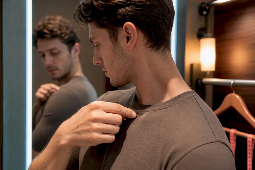
Solid colours consistently outperform patterns and logos, and there's a technical reason beyond taste. Photographers warn that narrow stripes and small repeating patterns can create a moiré effect once a camera sensor tries to render them, producing an odd rippling texture that looks like a glitch rather than a shirt. A textured solid, like a waffle knit or a subtle weave, photographs far better than any print.
For your lineup as a whole, aim for variety with purpose:
- Lead photo: a well-fitted solid shirt in navy or charcoal, ideally a portrait shot.
- Second or third photo: a different colour outdoors, showing you in context rather than posed.
- One smarter shot: a collared shirt or light jacket, since Photofeeler's research on formal dress suggests it lifts perceived competence.
Pro Tip: If you own one well-fitted shirt in a mid-tone colour, that single item can anchor three different photos, just change the setting and pose each time.
Colour and outfit mistakes that quietly kill matches
A handful of choices do outsized damage, and most of them are easy to fix once you know to look for them. True neon and extremely saturated brights sit at the top of the list, since they cast colour onto your skin and pull focus away from your face entirely.
Pure white and pure black deserve real caution in harsh sunlight or high-contrast settings, where compression tends to erase the fabric detail that makes a shirt look intentional rather than accidental.
Beyond colour, a few outfit choices carry their own risk regardless of shirt shade: shirtless mirror selfies, which dating-photo research consistently flags as a red flag rather than a flex, large branded logos, busy small-scale patterns, sunglasses that hide your eyes, and group photos as your main image. Fix the shirt, then fix the frame around it.
What does the evidence actually say about shirt colour?
Photographer guidance and independent testing point in the same direction: mid-tones win, fit matters more than most people assume, and palette choices should respond to the setting rather than fight it. Guides built around real photoshoot outcomes repeatedly land on the same shortlist of navy, charcoal, and jewel tones for exactly this reason.
That overlap is also how DoubleMyMatches approaches AI photo scoring. The model weighs lighting, expression, and composition together, the same three factors photographers have flagged for years, rather than treating shirt colour as an isolated variable.
A shirt colour choice never works in isolation. Lighting, background, and expression all interact with it, which is why a colour that looks great in one photo can fall flat in another.
Every photo run through DoubleMyMatches gets analysed and then discarded. Nothing is used to train the underlying model, and nothing gets published anywhere.
Does shirt colour change how people perceive your personality?
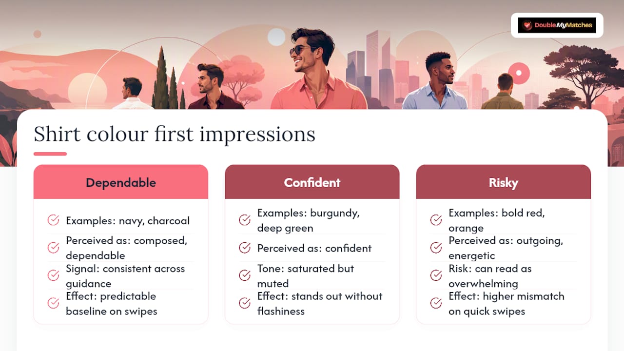
Colour choice shapes first impressions long before anyone reads your bio, and dating apps compress that first impression into a fraction of a second. Navy and charcoal tend to read as composed and dependable, which is a big part of why they perform consistently across dating-photo guidance. Burgundy and deep green skew towards confident without tipping into flashy, since they're saturated enough to stand out but muted enough to avoid looking like a costume.
Brighter, louder colours send a different signal, not necessarily a bad one, but a riskier one. A bold red or orange can read as outgoing and energetic to one viewer and overwhelming to another, and because a Tinder swipe happens so fast, there's rarely time for nuance to register. Neutral, mid-tone colours give you a more predictable baseline impression, which matters more on a platform built around instant judgement than it would in, say, a job interview where someone has ten minutes to adjust their view of you.
It's worth remembering this isn't really about the shirt convincing anyone you're trustworthy or interesting. It's about the shirt getting out of the way so your expression and the rest of the photo can do that work. A colour that clashes with your setting or your skin tone pulls attention towards itself, and every second spent looking at the shirt is a second not spent looking at you.
Do cultural or regional colour preferences matter on dating apps?
Colour associations shift depending on where you and your matches are based, though the underlying photography rules don't change much. In some regions, white carries strong associations with formality and cleanliness, while in others it's linked to mourning, so a white shirt might read as neutral in one cultural context and slightly odd in another. Red carries similarly mixed meanings, read as bold and passionate in some places, more aggressive or attention-seeking in others.
None of this should overrule the technical guidance already covered. The camera and compression issues with pure white and pure black apply regardless of where you or your match live, and a colour that causes cast or moiré will cause it everywhere.
What's worth adjusting is intensity and context rather than the core colour family. If you're using photos likely to be seen across a broad, international audience, sticking with the safer mid-tones (navy, charcoal, deep green, burgundy) sidesteps most cultural ambiguity, since these colours read as put-together in a wide range of contexts, based on Signal Studio's guidance on dating profile photos. Save bolder or more culturally loaded colours for photos further down your lineup, where you've already established a strong first impression and have more room to show a bit more personality.
The Team @ DoubleMyMatches: what we've seen work in real profiles
Profiles that lean on navy, charcoal, or a well-fitted mid-tone colour tend to hold up better across a lineup than ones chasing a standout shade. The most common error isn't colour at all, it's wearing the same fit and tone in every photo, leaving nothing to compare. Test one variable at a time: swap the lead shirt, keep everything else fixed, and see what shifts.
— The Team @ DoubleMyMatches
See exactly which shirt colour works best in your own photos
Reading colour guidance only gets you so far. Your skin tone, your lighting, and your background are all unique to you, and the fastest way to know which shirt actually wins is to test it directly. An AI service gives you instant scoring on lighting, expression, and composition, then orders your photos from best to worst, so you can see in seconds whether that navy shirt or that burgundy one earns the top slot in your lineup.
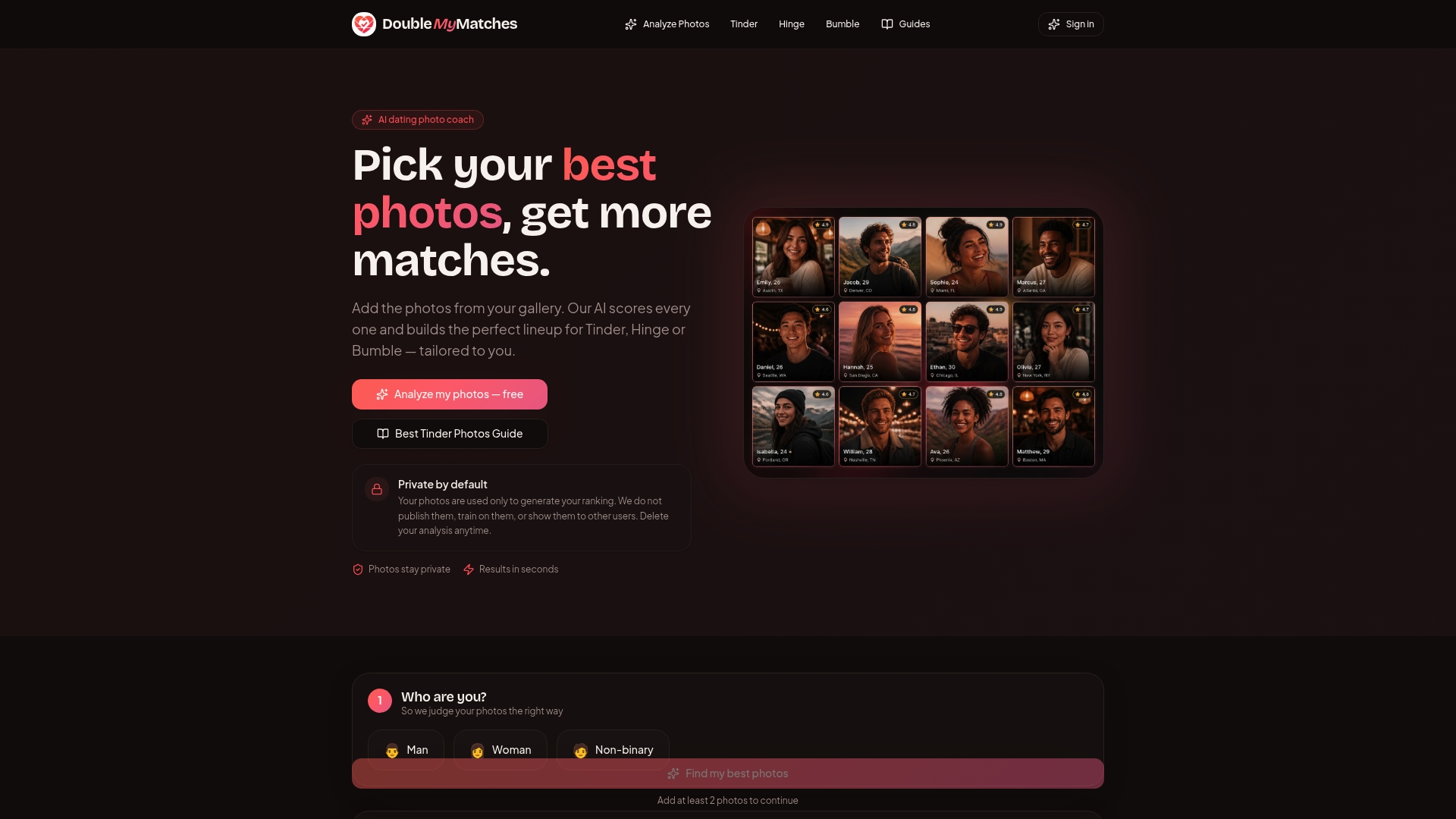
Every photo you upload is analysed once and then deleted. Nothing is kept, published, or used to train the AI, so you get honest feedback without handing your photos over to strangers on a crowd-voting site. The Full Report costs $7 as a one-off, and if you want to retest after making changes, Retest & Lock In is $17. If you're curious how this compares to older crowd-rating tools, see how AI photo analysis stacks up against Photofeeler. Upload your current lead photo now and find out where your shirt colour is actually landing.
Sources
- Best Tinder Profile Photos: A Photographer's Guide to More Matches | Photography Shark Studios
- Best Dating Profile Photos: Hinge, Bumble & Tinder Guide
- How to pick outfits for photoshoots: The 2026 Guide
- What to Wear in Photos: The Three Things a Camera Exaggerates | Real World Appeal
- What to wear for dating profile photos
FAQ
What colour shirt looks best in photos?
Mid-tone, solid colours such as navy, charcoal, deep green, and burgundy consistently look best because they photograph cleanly and don't distract from your face. Photography-based guides recommend these shades over bright or extreme colours for exactly this reason.
Is a shirtless pic bad on Tinder?
A shirtless mirror selfie as your main photo is one of the most commonly flagged mistakes in dating-photo research, since it often reads as a red flag rather than confidence, based on SwipeStats' analysis of Tinder pictures. If you want honest feedback on whether a specific photo helps or hurts your profile, running it through DoubleMyMatches gives you a direct answer rather than a guess.
Is it true that most Tinder users are men?
Tinder's exact gender split isn't published with a verified figure available here, so any specific percentage circulating online should be treated with caution. What matters more for your strategy is that photo quality, not gender ratios, is the variable you actually control.
What colours should you not wear for a photo shoot?
Avoid true neon and extremely saturated brights, since they can cast colour onto your skin, and be cautious with pure white or pure black, which photoshoot outfit guides warn can lose fabric detail once an image is compressed. Small patterns and narrow stripes are also worth skipping, since they risk a rippling moiré effect on camera.
How much does it cost to get my Tinder photos analysed?
DoubleMyMatches offers a Full Report for $7 as a one-off, with a Retest & Lock In option available for $17 if you want to check your photos again after making changes, both listed on the DoubleMyMatches site.