
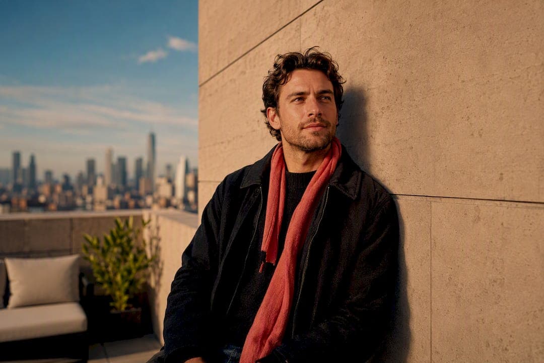
The single background rule that matters most: keep it simple, and match the light to your face. A cluttered wall, a dark bar corner or a sunny window behind a shadowed face all send the same signal, that you didn't think this through. Fix your lead photo first, clear the background clutter, check the lighting matches, and every other photo gets easier from there.
TL;DR:
- Bright, simple backgrounds that match lighting direction and warmth improve profile photo quality across all dating apps.
- Outdoor scenes during golden hour enhance full-body shots and convey an active lifestyle, especially for Tinder.
- Indoor backgrounds like cafes or bookshelves work well for Hinge, where personality cues are more important than scenery.
- Using AI tools to blur or subtly enhance backgrounds can help without compromising authenticity or making photos look fake.
- Consistency in setting and lighting across your photo lineup reinforces credibility and makes your profile more cohesive.
Table of Contents
- Dating photo background basics: what makes a lead photo work
- Backgrounds for dating pics: which type suits which photo
- Turning your background into a conversation hook
- Tinder vs Hinge vs Bumble: does the background rule change?
- Fixing backgrounds with editing and AI, without it looking fake
- Planning backgrounds across your whole profile
- Real examples: background fixes that changed the outcome
- Why this advice works: notes from DoubleMyMatches and photographers
- What we see most often, and the one change that surprises people
- Let DoubleMyMatches check your backgrounds for you
- Sources
Dating photo background basics: what makes a lead photo work
Your lead photo has about one second to earn a swipe. That's not an exaggeration, it's how thumbnail scanning works on every major dating app. In that second, the background is either helping your face stand out or fighting it for attention.
Subject-background separation is the technical term for this, and it's simpler than it sounds. You want visible contrast between you and whatever's behind you, some depth so you're not flattened against a wall, and enough clearance around your head and shoulders that the eye lands on your face first. A dark jumper against a dark bookshelf kills separation instantly. So does stand right up against a patterned wall with no breathing room.
Simplicity does double duty here. At thumbnail size, a busy background doesn't read as "interesting life", it reads as visual noise. Viewers can't parse detail that small, so texture, clutter and competing colours just blur into distraction. A London dating photographer's guide to app photos makes this point directly: the lead photo should be clear, well lit, and show a background that reflects your personality without cluttering the frame.
Then there's the lighting-match principle, which is where most people trip up without realising it. Your face and your background need to share the same light direction, the same warmth, and consistent shadows. If your face is lit from a soft window on your left but the background behind you is in flat overhead light, the photo looks subtly wrong even to someone who couldn't tell you why.
Pro Tip: Stand facing a window during the day and check your shadow. If your face has a soft, even shadow but the wall behind you looks flatly lit or vice versa, move a few steps until both match.
Three things to check before you keep a lead photo:
- Does your face stand out clearly from what's behind you, with no colour or tone clash?
- Is the background simple enough to read instantly at a tiny thumbnail size?
- Do the light direction and warmth on your face match the light on the background?
DoubleMyMatches' photo analysis flags lighting mismatches as one of the most common reasons a strong face photo still underperforms, and that lines up with what photographers see on shoots every week.
Backgrounds for dating pics: which type suits which photo
Not every photo in your lineup needs the same kind of background. Different slots do different jobs, and the background should match the job.
- Plain, clean walls for your lead photo. A neutral wall, painted or textured but uncluttered, gives maximum legibility at thumbnail size. This is the safest studio photo for dating profiles because there's nothing to distract from your expression.
- Outdoor scenes in golden hour for full-body shots and Tinder primaries. Late afternoon light is flattering, warm, and directional, which solves the lighting-match problem almost automatically. Outdoor dating backgrounds also signal an active life without you having to say it in your bio.
- Café, bookshelf or home interior for Hinge and conversation-focused slots. These romantic photo backgrounds carry personality cues, books you've read, a favourite coffee spot, without overwhelming the frame.
- Activity, pet or location shots for authenticity and hooks. A hiking trail, a dog park, a specific market stall. These work because they're specific, not because they're scenic.
A few backgrounds to avoid on principle. Busy rooms with visible mess in frame undercut trust before anyone reads your bio. Mirror selfies almost always introduce background clutter, reflections, phone glare, that fights your face for attention. And group photos where the background includes several other people create confusion about who you actually are, which is the opposite of what a profile photo is for. If you're unsure which shots are dragging your lineup down, a checklist for picking dating photos that get matches is worth running through before you upload anything.
Turning your background into a conversation hook
A background isn't just scenery, it's a prompt. The right one gives a potential match something concrete to comment on instead of typing "hey" for the hundredth time.
Recognisable, promptable locations beat generic "nice" places every time. A named café, a specific market, a trail with a distinctive view all invite a real question. "Vague scenic backdrop" invites nothing, because there's nothing specific to ask about. Practitioner notes on Hinge profile photos back this up directly, environments that explicitly invite questions cut down on generic openers because they give matches an actual topic.
Pairing a background with a bio prompt strengthens the effect further. A photo at a climbing gym next to a prompt like "the way to win me over is a chalk-covered high five" does more work than either element alone.
Two examples worth borrowing:
- Café photo, cup visible: "This is my order. Judge me or bring me a better one."
- Trail photo, mid-hike: "Currently accepting nominations for the next summit."
Inconsistent or overly aspirational backgrounds cost you trust, and it happens fast. Someone whose bio says "homebody who loves cooking" but whose only photo is a yacht in Monaco creates a credibility gap before the conversation even starts. Backgrounds should feel like evidence for the person you're describing, not a separate performance.
Tinder vs Hinge vs Bumble: does the background rule change?
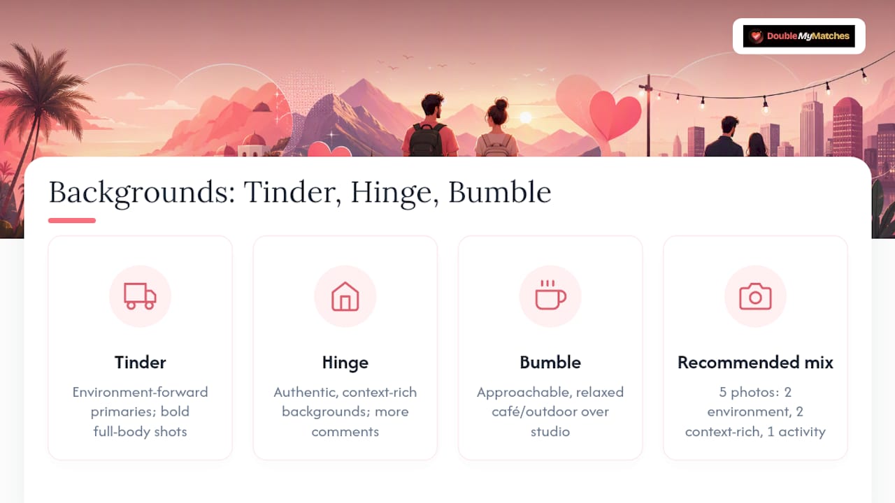
Yes, and this is where a lot of otherwise decent profiles lose ground, using the same photo style across every app instead of matching the background to what each platform actually rewards.
Tinder rewards bold, environment-forward primaries. Full-body shots with a strong visual backdrop, an interesting street, a beach, a stadium, tend to outperform tight headshots against a wall. Tinder users swipe fast, so a vibrant, scene-setting background helps you register in that split second before a face-only photo would.
Hinge rewards authenticity over polish. Warm, natural light and context-rich backgrounds, a bookshelf, a kitchen, a local park bench, consistently generate more comments than a plain studio setup. Analysis comparing Hinge engagement patterns found that context-rich backgrounds increase comments and engagement compared with plain backgrounds, which matters directly given how much of Hinge's format depends on comment-based openers.
Bumble sits between the two. It rewards approachable, confident images, but over-produced or clearly staged photos read as try-hard rather than aspirational on this app. A relaxed café or outdoor setting with natural light usually beats a heavily styled studio photo for dating on Bumble specifically.
Broader research on Tinder versus Hinge photo rules confirms this split, Tinder favours environment-forward, high-contrast primaries while Hinge rewards authenticity and detail. A sensible mix, roughly two bold environment shots, two context-rich indoor or café shots, and one activity photo, covers most of what any single app rewards without forcing you to build entirely separate lineups.
Fixing backgrounds with editing and AI, without it looking fake
Sometimes the best photo you have has the wrong background. That's fixable, but only if you're careful about how far you push the edit.
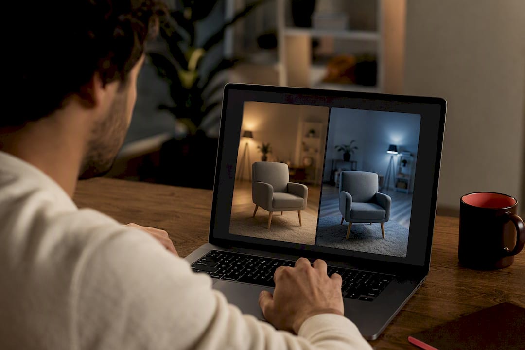
Background blur is the safest first move. If your face is sharp and well lit but the room behind you is cluttered, a soft blur removes the distraction while keeping the shot believable. This works because it mimics what a decent camera lens does naturally, so it doesn't read as artificial the way a full background swap can.
If you're replacing a background entirely rather than blurring it, the lighting-match principle applies even harder than in an unedited photo. The new background needs the same light direction, the same warmth, and shadows that fall the same way as they do on your face. Mismatched lighting is the single biggest tell that a photo has been altered, and it's exactly what erodes trust once a match notices.
A few prompts worth using with any background for dating photos editing tool:
- "Blur the background softly, keep my face and details unchanged."
- "Enhance the lighting naturally, don't change my skin tone or features."
- "Remove background clutter only, leave my expression and pose as they are."
According to guidance from an AI photo editing tool built for dating profiles, quick fixes like these, softening a background or correcting lighting, can be done in fifteen to thirty seconds when the prompts stay subtle rather than dramatic.
Pro Tip: If an edited photo looks noticeably better than every other photo in your lineup, that gap is itself a red flag to matches. Aim for consistent quality, not one dramatically enhanced outlier.
Over-editing is the real danger here. A background that's been swapped in with mismatched shadows, or a blur so heavy it looks like a stock photo template, tends to lower perceived authenticity rather than raise it. Believability beats perfection every time.
Planning backgrounds across your whole profile
One strong lead photo doesn't fix a weak lineup. Apps and matches judge your whole set, so the backgrounds across all your photos need to work as a set too.
A reliable roadmap: one anchor photo with a simple background, two context shots (café, home, outdoor) that add personality, one activity or hobby shot, and one social or fun photo that shows you with others or laughing at something. Recommendations across the best-performing photo mixes for Tinder and Hinge consistently land on four to six varied photos rather than five nearly identical headshots.
Consistency matters more than people expect. Keep lighting roughly similar across the set, and stick to a limited colour palette rather than jumping from a bright orange jumper in one photo to head-to-toe black in the next. This isn't about matching outfits, it's about the set feeling like one coherent person rather than five separate castings.
If you're using AI tools to touch up several photos, avoid making them all look like the same studio session. A little visual variety, different rooms, different outdoor spots, different times of day, reads as a real life. Five photos with identical soft-box lighting reads as generated, even when it isn't.
Before uploading, run this quick check on your set:
- Does at least one photo have a clean, simple background for the lead slot?
- Do at least two photos give a match something specific to comment on?
- Is there genuine variety in setting, not just outfit?
- Does lighting look consistent enough that the set feels like one person?
- Would a stranger be able to describe your personality from the backgrounds alone?
More detail on assembling a balanced set is covered in this guide to photo variety in dating profiles.
Real examples: background fixes that changed the outcome
Lead-photo simplification. Before: a headshot taken in a cluttered kitchen, dishes visible, mixed light sources creating uneven shadows on the face. After: the same person, same day, moved two metres to stand against a plain hallway wall near a window. Same face, same expression, dramatically cleaner read.
Activity-photo improvement. Before: a hiking photo taken from too far away, with the subject a small, dark silhouette against a bright sky, background overexposed. After: cropped closer, shot with the sun behind the photographer rather than behind the subject, so the trail and the face are both properly lit.
AI-replace gone wrong. Before: a flat, evenly lit indoor selfie. After: an AI tool swapped in a sunset beach background, but the face still carried the flat indoor lighting, no golden warmth, no directional shadow. The mismatch was obvious within a glance, and it read as fake rather than flattering.
Quick dos and don'ts:
- Do check background clarity at thumbnail size, not just full screen, since that's how most swiping happens.
- Don't let a mirror or window create glare that competes with your face.
- Do match warmth and shadow direction whenever you edit or swap a background.
- Don't stack three photos with the exact same wall or setting, it reads as a lack of effort.
Photographer-backed before/after checklists consistently show that these small background corrections, not full photoshoots, tend to shift engagement the most.
Why this advice works: notes from DoubleMyMatches and photographers
DoubleMyMatches' AI scores photos across lighting, expression, and composition, the same three factors photographers check on every shoot, which is why the two approaches keep landing on the same fixes. Lighting mismatches between face and background are among the most frequent issues flagged during analysis, right alongside cluttered or distracting backdrops.
Every photo is analysed once and then discarded, never published, never used to train the model. You get direct, per-photo feedback and a best-to-worst ranking without your images sitting on a server indefinitely.
Users consistently report clearer, more confident profiles after acting on flagged issues, particularly background and lighting fixes, since those are the corrections that require no new photoshoot, just a better choice from what you already have.
What we see most often, and the one change that surprises people
The mistake we correct more than any other isn't a bad face or a bad angle, it's a background that doesn't match the lighting on the face. People fix their expression, their outfit, their angle, and completely overlook that the wall behind them is lit differently to their skin. It's subtle enough that most people can't name what's wrong, they just sense the photo feels "off".
The counterintuitive lesson: the photo with the "nicest" background isn't usually the one that performs best. A polished restaurant shot often does worse than an ordinary café photo with a coffee cup in frame, because the ordinary one gives matches something to actually ask about. Context beats polish, consistently.
Try this over the next week: pick your current lead photo, check whether the background lighting matches your face, and swap in an alternative if it doesn't. That one change alone shifts more profiles than a full reshoot ever does.
— The Team @ DoubleMyMatches
Let DoubleMyMatches check your backgrounds for you
Reading the rules is one thing, knowing exactly which of your own photos are hurting you is another. DoubleMyMatches' AI photo analyser scores each of your photos on lighting, expression and composition, then flags the specific background or lighting issues dragging your lead photo down.
You'll get a best-to-worst ranking of your current lineup, per-photo feedback on what's working and what isn't, and suggestions for which photo should sit in which slot. Every photo is analysed once and discarded afterwards, never published, never kept, never used to train anything. If you're ready to stop guessing which background is costing you matches, rank your dating photos with a one-off report and see exactly where the fixes are.
Sources
- Dating Photographer’s Guide to the Best Dating App Photos for Tinder, Bumble & Hinge in London
- AI photos for Hinge: what gets likes vs what gets left-swiped
- Tinder vs Hinge photo rules 2026
- Tinder profile photos - Free AI tool | EditThisPic